Frontlist | Judging a book by its cover- Role of book covers
Frontlist | Judging a book by its cover- Role of book coverson Jan 25, 2021
What’s so important about a book cover? Lots, if you look behind the cover, literally
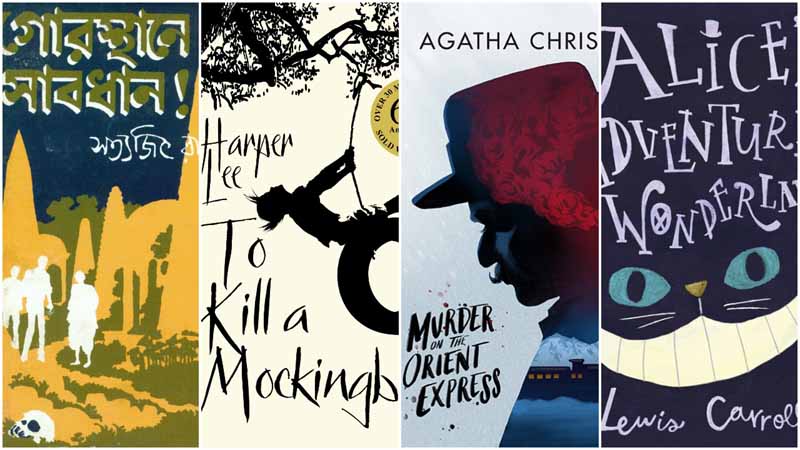
Gorosthaney Sabdhane, one of Satyajit Ray’s most read detective Feluda books, has a cover which gives you the creeps. Two contrasting hues and the figure against the backdrop immediately establish that it’s a crime novel. Of course, we know that Ray had a knack for crime fiction. But it’s not always that book covers match the content. Take for example, the cover of Umberto Eco’s debut novel (1980) The Name of the Rose. The minimalistic cover has a solitary bird sitting next to a chair and in the title, the word ‘rose’ is crossed out in red. Intriguing indeed. The book is actually a historical murder mystery set in an Italian monastery of 1327. The whodunit sold over 50 million copies worldwide. Or, take the cover of Wet Apples, White Blood which has a lone white droplet streaking down the plain red cover. The design would definitely prompt a reader to open the book, a collection of poems that was inspired by the role of nursing in human evolution and offers glimpses into archetypes of breastfeeding women in history and myth. Drawing the reader Indeed, a book cover often makes a reader pick it up. In a market overcrowded with titles today, book cover designs are getting even more attention.Maina Bhagat, director, Oxford Bookstores and Apeejay Literary Festival, puts it aptly: “The first ‘sales pitch’ is the cover. If it’s not striking enough to draw attention, it will be passed over for something more interesting. A well-designed cover assures the reader that the book is of a high quality, both in content and delivery. The cover can scare away a customer or lure them in. It’s a basic marketing strategy.”There are even special prizes nowadays instituted by bookstores and publishers to encourage designers to inject new blood into this segment of book publishing. Bhagat informs, “The Oxford Bookstore Book Cover Prize is a first-of-its-kind award for brilliance in book design, an attempt by the iconic bookstore to recognise the extraordinary work of illustrators across India. Instituted in 2015, the new prize appreciates the importance of the balance of graphics and narrative, particularly in our increasingly visual age.” Avid readers usually remember good books, staying with them for a long time, but casual readers often remember stunning covers. So for publishers it is important to design covers that stand out especially as it is becoming increasingly difficult to get readers hooked. Even more so with Online books as readers browse through hundreds of thumbnail size pictures. Online book selling has indeed encouraged a trend for brighter, fluorescent, super saturated covers and white-out text in print. Designed to the theme Look at Albert Camus’ Exile and the Kingdom. The cover is in asymmetry to make a strong visual impact. The designer experiments with black and white rectangles to create a disjointed look metaphorically depicting the characters constantly at odds with the world they live in. Says Sanjoy Roy, managing director, Teamworks Arts, and the man behind Jaipur Literature Festival, “In these times of heightened visual imaging, you need to be ahead of the curve. The idea is not necessarily to be glitzy or over-hyped but being true to the book. Finally good design stands out in a million ways and helps focus attention on the key theme of the book.”
Roy adds, “There’s a saying ‘Don’t judge a book by its cover’, but research points out that spur of the moment buying is based on the cover of the book and more so the spine. Evocative book covers go a long way to furthering book sales. Spoiler alert: Should the content between the covers turn out to be unreadable, the book will sink irrespective of its stunning cover.”Most designers agree that book covers need to draw the reader into the story showing what the book is about, without giving it all away. The whole idea is to get the reader open the book and then the author’s magic should start working. Susanta Paral, designer and visualiser, says : “Book cover designing is a visual representation of the inside story. As a designer one has to read and digest the book before pointing out the USP of the book to the target audience. After the first cut of layouts, we have to discuss with the author and publisher. How the author visualises his book and how the publisher wants to market the book are important to know. Publisher input is important because printing cost is involved in this matter, like the book’s size, hardcover or paperback, glossy or matte, thickness of the paper etc. After resolving all these, we start designing.” But commissioning attractive book covers could also increase the cost, right? Says Bhagat, “Often, a professional cover boosts a book’s sales- enough to justify the cost. Sales figures endorse this and the cost of a professionally designed cover is built into the retail cost.” “Great covers draw the reader’s attention, suggest the tone of the work while taking into consideration the potential cultural expectations of the reader. Furthermore, the importance of cover design has prompted many big publishers to come up with different covers for different markets, catering to the unique culture of each region and considered a wise investment,” she adds.
Talking of markets, children’s book publisher Pranav Kumar Singh of Ponytale Books says, “It’s a challenge to grab the attention of kids as well as parents because they are the deciding factor in buying the book. The book cover has to be playful, appropriate for the age group, eye catching and well-illustrated. The lettering and the fonts especially should arouse interest. Ideally the cover should create a world children want to be immersed in.”For little older children, picture books like Machher Jhol by Richa Jha and illustrated by Sumanta Dey, work. The story revolves around Gopu, who is blind but has to step out when his father falls sick. He negotiates the crowds, the markets and traffic of Kolkata to reach his grandma’s house to get her cook his father’s favourite fish curry. The cover with a steaming fish curry being cooked with an apt title in simple fonts, doesn’t give out the story but is alluring enough to attract fish-lovers, especially Bongs. Redesigning A trend catching up is redesigning the covers of classics. Like Ruskin Bond’s The Room on the Roof. On its 60th anniversary it’s now back with a new cover and gorgeous illustrations. Harper Lee’s unforgettable To Kill a Mockingbird, was reprinted on its 50th year in 2010 with a new, attractive book cover.
“Classics tend to have plain covers and run the risk of being ignored because their old covers date them. Old fashioned book covers have to compete with recent book covers, hence publishers bring new life to classics by redesigning their covers,” Singh says.
Even Agatha Christie’s Murder on the Orient Express cover was redesigned. The original cover focused on the train itself. The new cover by Jefferey Nguyen draws attention to the figure of Hercule Poirot —Christie’s famous detective. The use of a limited colour palette creates a stark light and dark contrast, mirroring the duality of the murder committed on the train.Children’s classic Lewis Carol’s Alice in Wonderland was redesigned by Korean designer Maya Tatsukawa. Instead of focusing on Alice, like most traditional covers do, this one focused on the Cheshire cat’s eyes and mouth. The title itself is carefully crafted to capture the attention of readers by including details from Wonderland — such as the Hatter’s hat on the “I” and the target on the “O.”. In just four words, it manages to portray the madness inherent in this classic story. JD Smith, graphic designer, says: “Big publishers spend thousands to ensure a cover is right. It is normal for big publishers to have 50 plus covers designed for a single book so they get it ‘just right.’ All because a book cover is its face and it generates expectations.”ions.”
Source: India Blooms


.jpg)


.jpg)

.jpg)
.jpg)
.jpg)
.jpg)
.jpg)
.jpg)




Sorry! No comment found for this post.