In the Instagram age, you actually can judge a book by its cover
In the Instagram age, you actually can judge a book by its coveron Apr 19, 2021

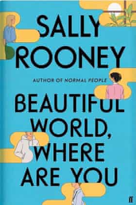
Last week’s big literary event was not the publication of a new book, the million-pound signing of a celebrity author or the announcement of a prestigious prize. Instead, it was the unveiling of a cover: the jacket of the forthcoming novel by Sally Rooney.
“It’s quite rare that a publisher will reveal a jacket and make such a big deal about who designed it, or even mention who designed it,” says Danny Arter, creative editor of The Bookseller, a magazine reporting on the publishing industry. But in recent years, book cover design has taken on a higher profile, and we may be seeing a new heyday for book design.

It was Rooney’s 2018 novel Normal People that Arter believes signalled the shift towards the book cover as a “cultural phenomenon on Instagram in terms of being almost like an accessory”. Scroll Instagram or Twitter feeds related to books, and eye-catching designs, with bright colours and bold graphics jump out.
With trips to bookshops a rarity over the past year, keen readers have been forced to do what they’re told not to: judge books by their covers. “The lockdowns have really shone a light on book cover design, perhaps more than ever,” says Holly Ovenden, who is responsible for the cover of the forthcoming novel Holding Her Breath by Eimear Ryan.
“With the resurgence of interest in new books comes the pressure on designers to really push the boundaries in new and engaging ways. Publishers, authors, bloggers and designers have been taking to online platforms like Twitter, Instagram and TikTok to share new eye-catching covers,” says Ovenden.
This year, The Bookseller’s British Book Awards will reinstate a category that has been missing for more than a decade: Designer of the Year. As a designer, you can “feel a bit like an afterthought,” says Anna Morrison, one of those shortlisted. “Having that category back is really positive.”
Authors recognise the importance of covers. “I’m extremely controlling about them,” says Olivia Laing, whose books’ covers are no strangers to social media. She chose a visceral Wolfgang Tillmans photo for her book Crudo, and was “very specific about the exact blue, which is called International Klein Blue and is the colour Derek Jarman used in his film Blue,” for the cover of Everybody. “Covers are so important,” she says. “As I’m so often writing about art, mine need to work for an art-world audience while also being approachable and stylish.”
When it comes to cover design, Jonny Pelham, a senior designer at Faber responsible for covering the books of Jonathan Franzen, Max Porter and Hanif Kureishi, believes that “graphic impact has been pushed to the top of the list of priorities”. What all “designers are trying to do, especially at the moment,” is come up “with instantly recognisable designs that hit hard and quick, while also rewarding closer inspection”.
Due to the long lead times, Peter Adlington, a senior designer at Faber, would “guess that many of the books on sale during the first half of the pandemic would have been designed before any of us had heard of a lockdown”. But what we did see was “that marketing teams had to suddenly find new ways to promote books in a solely digital space, and if you had a cover that suited that medium you could be incredibly creative”.
He designed the cover for Kazuo Ishiguro’s Klara and The Sun at the start of lockdown. Published last month, it has already become a regular feature on social media, photographed on influencers’ picnic blankets. “The design for Klara turned out to be extremely effective in this space,” says Adlington. “The cover itself was so simple and bold that you’d always recognise it swiping through Instagram.”
The shift to attention-grabbing covers has been happening, according to Arter, for the last 10 or 15 years. “As Amazon has become more important to authors and publishers to promote their books … it has to work on a really tiny thumbnail instead of a display table at a bookshop.”
With the advent of the “shelfie”, a social media phenomenon where people share pictures of their shelves, the cover found yet more limelight. And photographs of books, or books in piles – either yet to be read or recently read – have become a social media trope.
So has this focus on the cover ushered in a golden era for book-cover design? Morrison has been designing book covers since 2006 and feels now is the most exciting time. When people used to ask her for design ideas, “it would always be, ‘We don’t want it to look too weird or unusual’.” But today, a lot of the briefs are: ‘We want something completely fresh’.”
Adlington doesn’t believe that social media has ushered in a golden age, but does “think it’s extending the cover’s visibility and influence beyond the point of purchase”. Covers have taken on a different significance: “to both advertise the aspirations of the book and the person who reads it, much like being seen reading on the tube but with 50,000 people in the carriage.”
Take the simple yet beautiful covers of independent publishing house Fitzcarraldo Editions – all their fiction has the same plain Yves Klein blue cover, and the novels are a trend on social media. “They’re incredibly effective because they look collectible, they look timeless, and they look good stacked up on a bookshelf in the back of a Zoom call,” says Arter.
But of course the cover needs to work far beyond the purely aesthetic. The most important thing, says Adlington, is to “get the right cover for the book, rather than the right cover for Instagram”.


.jpg)


.jpg)

.jpg)
.jpg)
.jpg)
.jpg)
.jpg)


Sorry! No comment found for this post.